


5 / Overfishing, Space Trash and the Information is Beautiful Awards
5 / Overfishing, Space Trash and the Information is Beautiful Awards
November Edition.

Dear Reader,
The Information is Beautiful awards have started, we’ll be featuring a few of the nominated visual narratives on Buried Signals but I highly recommend browsing the Shortlist (and the Longlist) to discover exceptional work.
As this newsletter matures I'd like to include more practical insights, such as design tools or even code blocks - if you have ideas on information you'd like to see here please feel free to send me a message on Twitter.
Onward.
Visual Spotlight
We've gathered quite the spectacular Jury! I'm grateful they all agreed to participate and believe in the future of this project. In the near future I'll be extending project selection polling to the public via Discord and this newsletter, but for now here are the recent noteworthy spotlights.
This animated illustrative piece by the New York times felt like reading a comic or storybook about our future with climate change.
Fishing the Feed also combines illustration and animation to inform readers about the overfishing crisis.
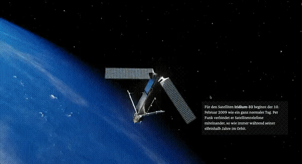
The first Weekly Spotlight poll's winner was Unser Müll im All by Zeit Online, which has unfortunately been pushed behind a paywall since then - these recordings will become useful!

Insights & Resources
We're collecting research about information design and narrative visualization within the Insights page. I'd also like to thank Pei Ying Loh for sharing the Kontinentalist's list of tools for visual journalism, all of which are now listed in Resources.
Over the next few months I'll be consolidating actionable insights from academic research and expert interviews into articles or Twitter threads such as this one :

Using analogy in the visual medium it has become possible to communicate quantities of a massive scale that are especially challenging for readers to understand.
I recently interviewed Victor Agulhon of the immersive journalism studio TARGO Stories! You can read the takeaways or watch the full interview here.
Having realized that these interviews were quite long, I've decided to reformat upcoming interviews. Focusing instead on much shorter and targeted segments about challenges in the craft. More soon!
Handpicked obsessions
Let people annotate or comment sections of your articles with Hypothesis
Use Felt to tell custom stories with maps
Experiments built with Stable Diffusion or Midjourney V4 have been exploding the internet - the results are remarkable.
This data vizualisation of Monarch butterfly populations

Thanks for reading! If you find this newsletter useful, please share it with colleagues or friends who might benefit.
All the best,
Tom