


8 / Blackouts, immersive reporting and human perception
8 / Blackouts, immersive reporting and human perception
Announcing the Spotlight Club online meetups to discuss incredible visualization.

Welcome to Issue 8!
Earlier this month we discussed improvements and ideas for the project with the members of the Jury.
As a result we’ve decided to start organising quarterly online meetups inviting the winners of the Monthly Spotlights to present their work and process to avid listeners. There will be limited spaces for these events but we will give notice on Twitter and in the newsletter for readers to apply to participate.
We've also opened a closed Slack channel to build a small community where we can spark conversations on new insights, get a second opinion on work in progress and share inspiration. If interested you can apply here!
Visual Spotlight
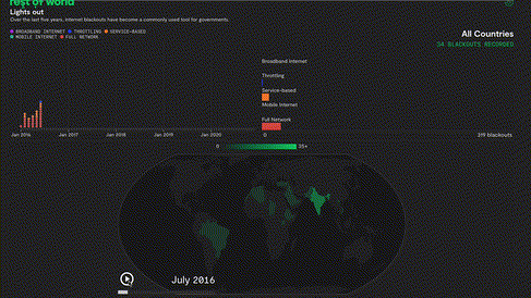
The February Spotlight goes out to Moksha Data Studio for their incredible work for Rest of World - In the Dark.
The project makes wonderful use of animation to show evolutions of data over time or to position readers geographically. The darkness used in the design also amplifies the theme of the story and creates a sense of foreboding.
Insights
This month I've had the pleasure of interviewing three members of the Jury who's work I deeply admire: Pablo Robles, Marco Hernandez and Peiying Loh. The latter two will be published on Buried Signals soon.
Here are some key insights from the interview with Pablo, which has inspired me to approach our next studio projects differently.
When possible immerse yourself physically in your reporting. Desk reporting frames the story from what we can collect on our screens. Immersion helps to create a fuller understanding of the subject, therefore a deeper connection with your readers.
This immersion also gives you a unique perspective. As you will be observing things differently, your story will bring a fresh angle is more interesting and attractive to readers.
It's all about the idea and reporting. You don't need to know or use all the fancy tools and effects to tell a visual story. With experience Pablo has noticed that keeping it simple is often better.
Today we have more and more distractions and less time to read, which is why visualisation is taking over the media. Your brain can process and understand visuals much faster, with less effort.
I also highly recommend reading this research synthesis by Kennedy Elliot, a massive undertaking that provides immense insight in a very short amount of time: 39 studies about human perception in 30 minutes.
Handpicked obsessions
The release of the Figma to Webflow Plugin
Paul Graham's article on Writing, briefly.
Visualization Universe by Google News Lab and Adioma
This example of Runway in use :
